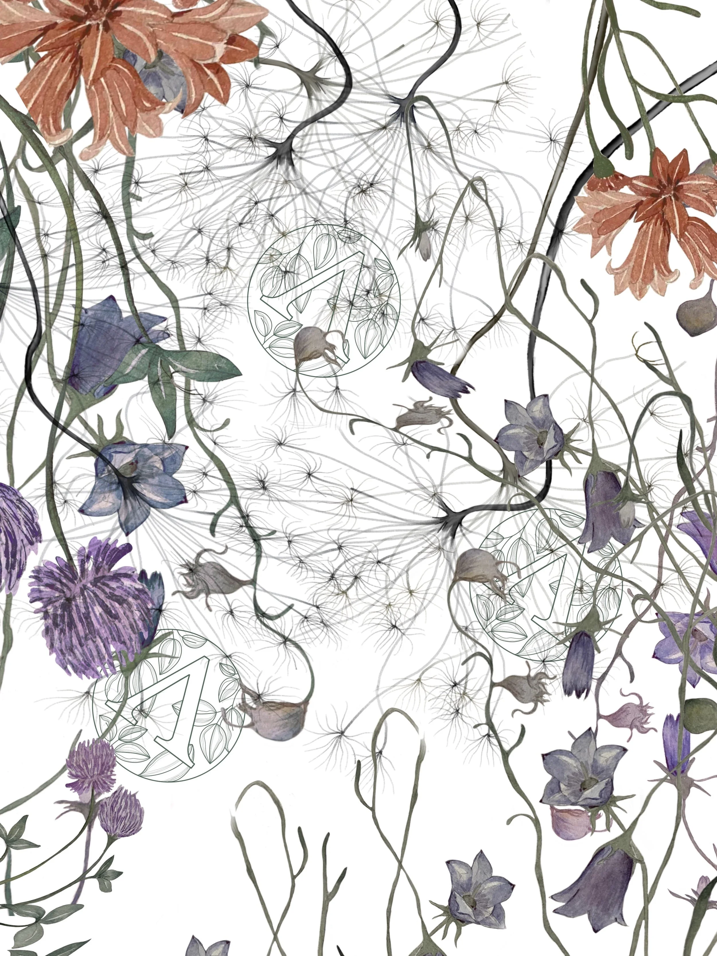
Branding and illustrations for nail school
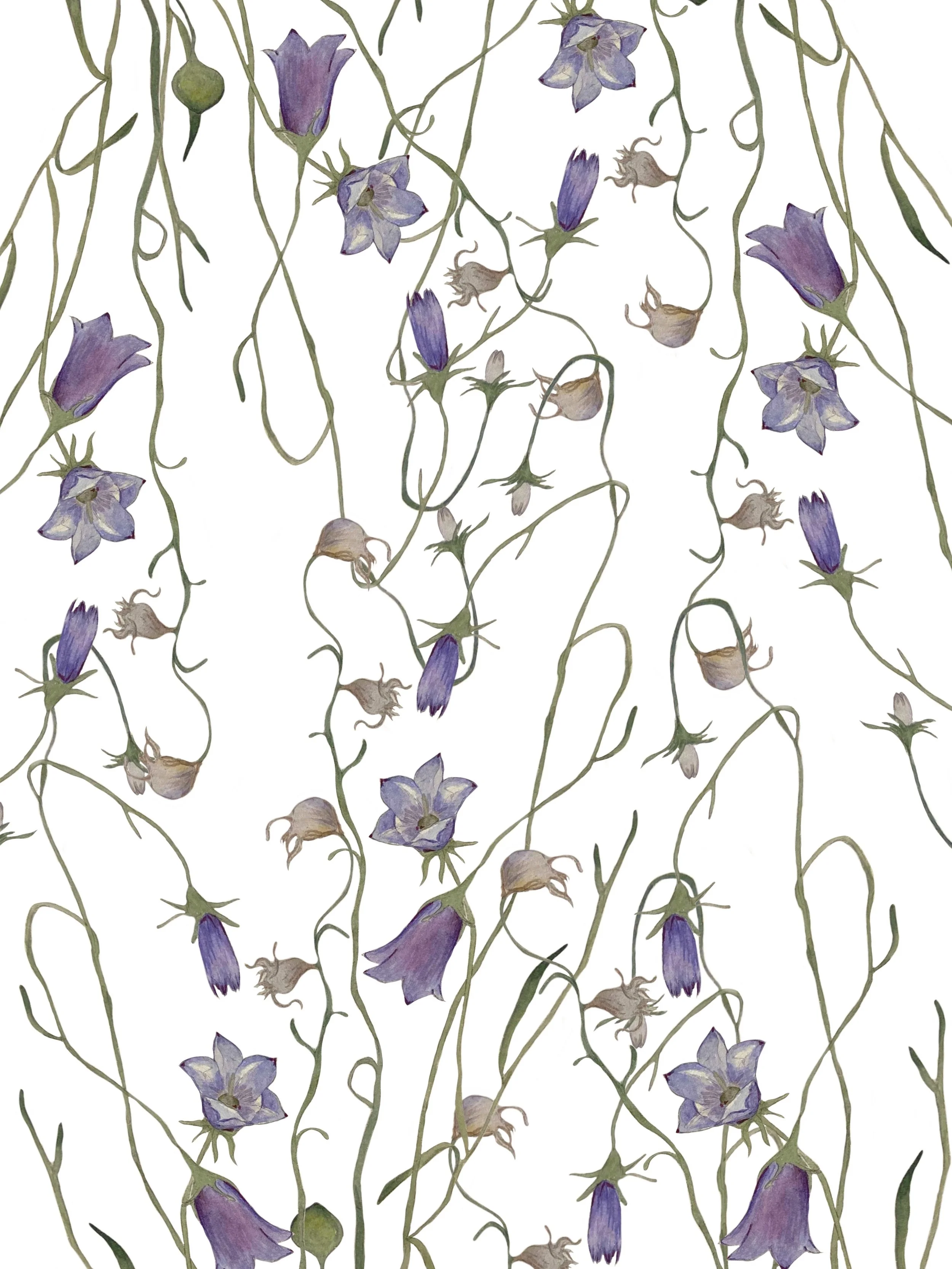
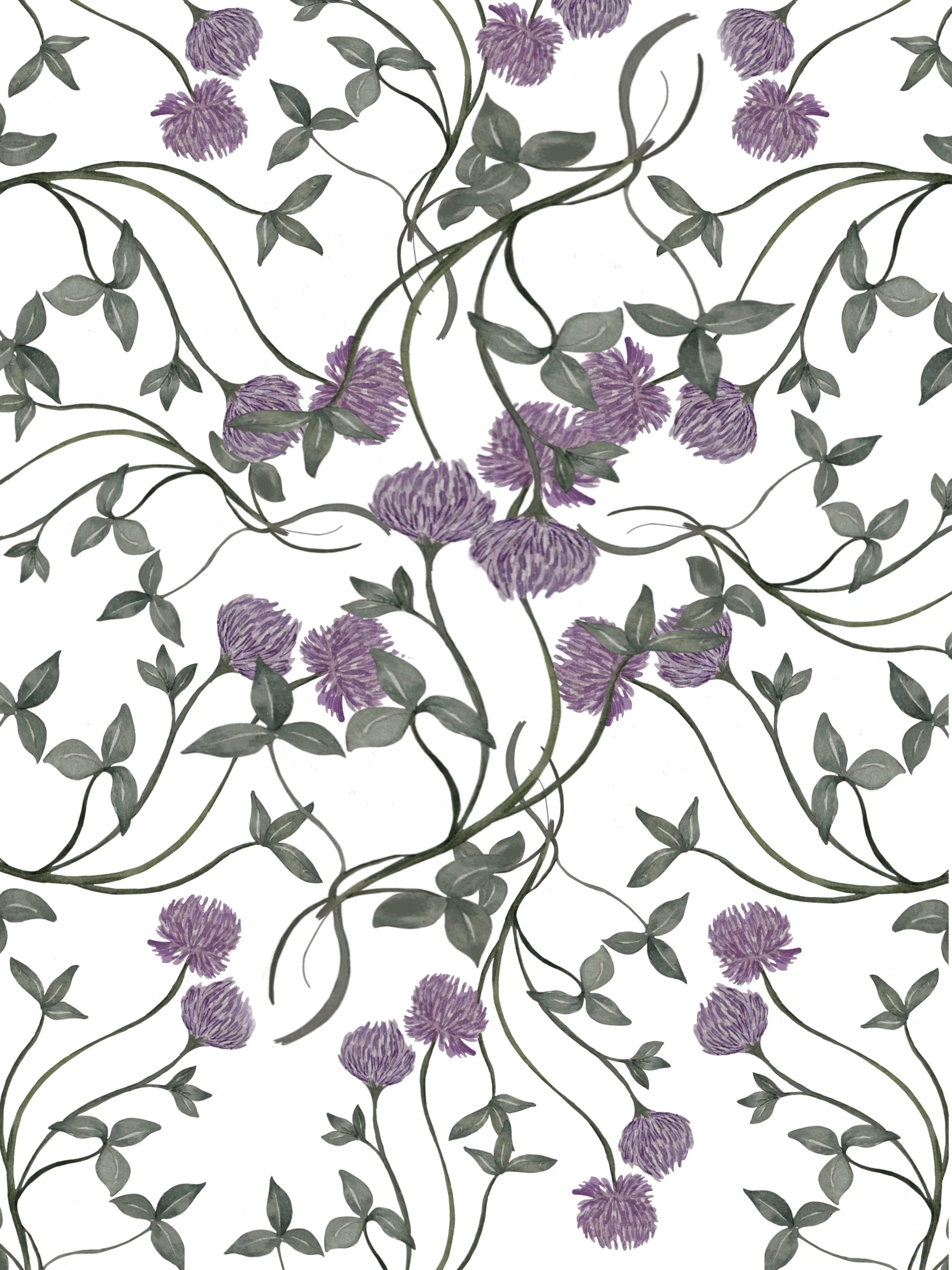
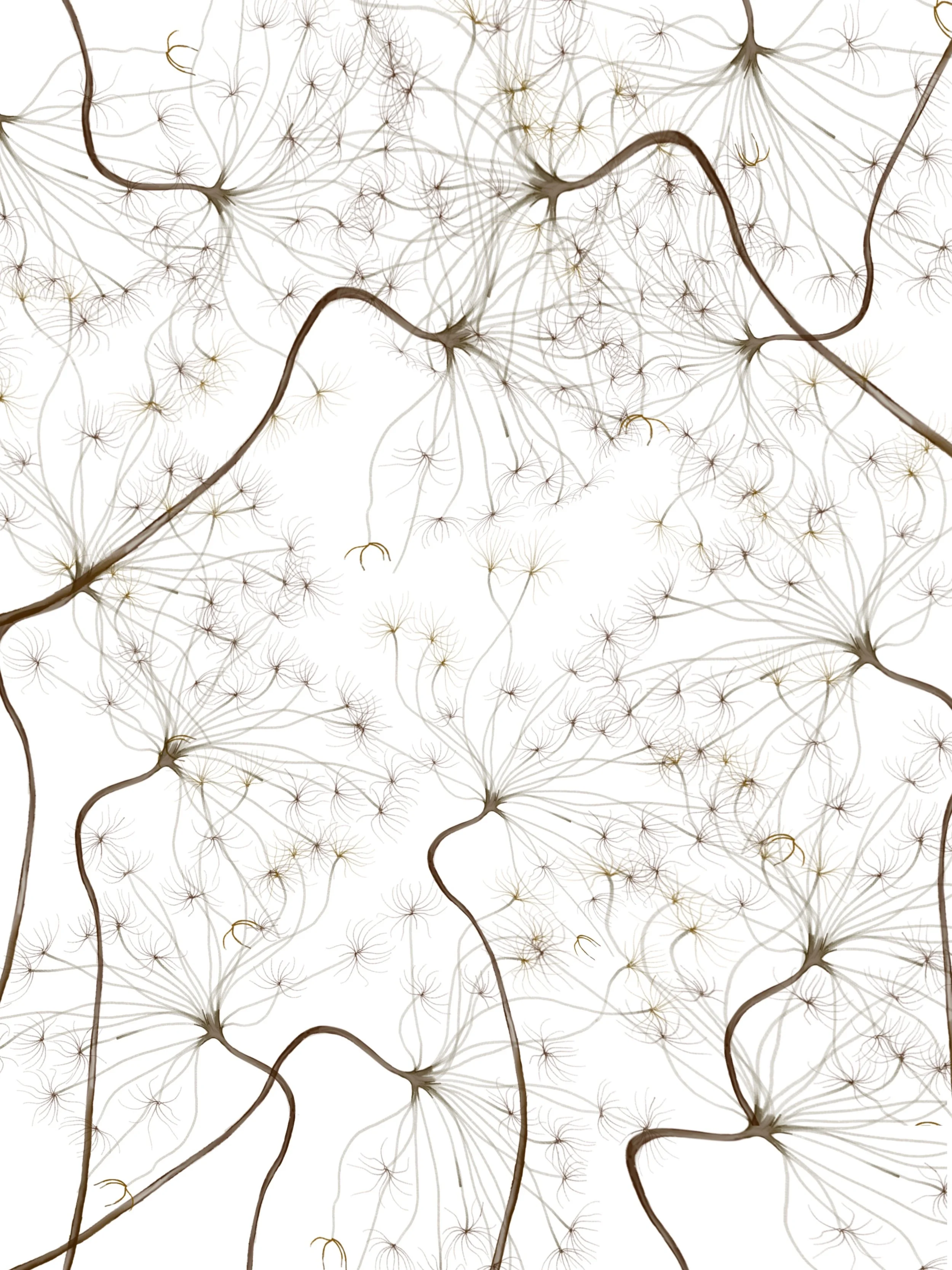
From the very beginning there was a clear understanding of the style for this project. The client wanted to create a logo with elements of botany, but at the same time not too delicate and girlish. Therefore, it was the shape of a circle that was chosen, and a strong letter B (the customer's initials) was drawn in the middle. The same approach was used to create prints. That is why flowers such as heather, dill flowers and bells were chosen. In terms of the color scheme I was trying to get away from the girlish pink shades and use more deep, but at the same time calm shades of violet, green and ocher.

